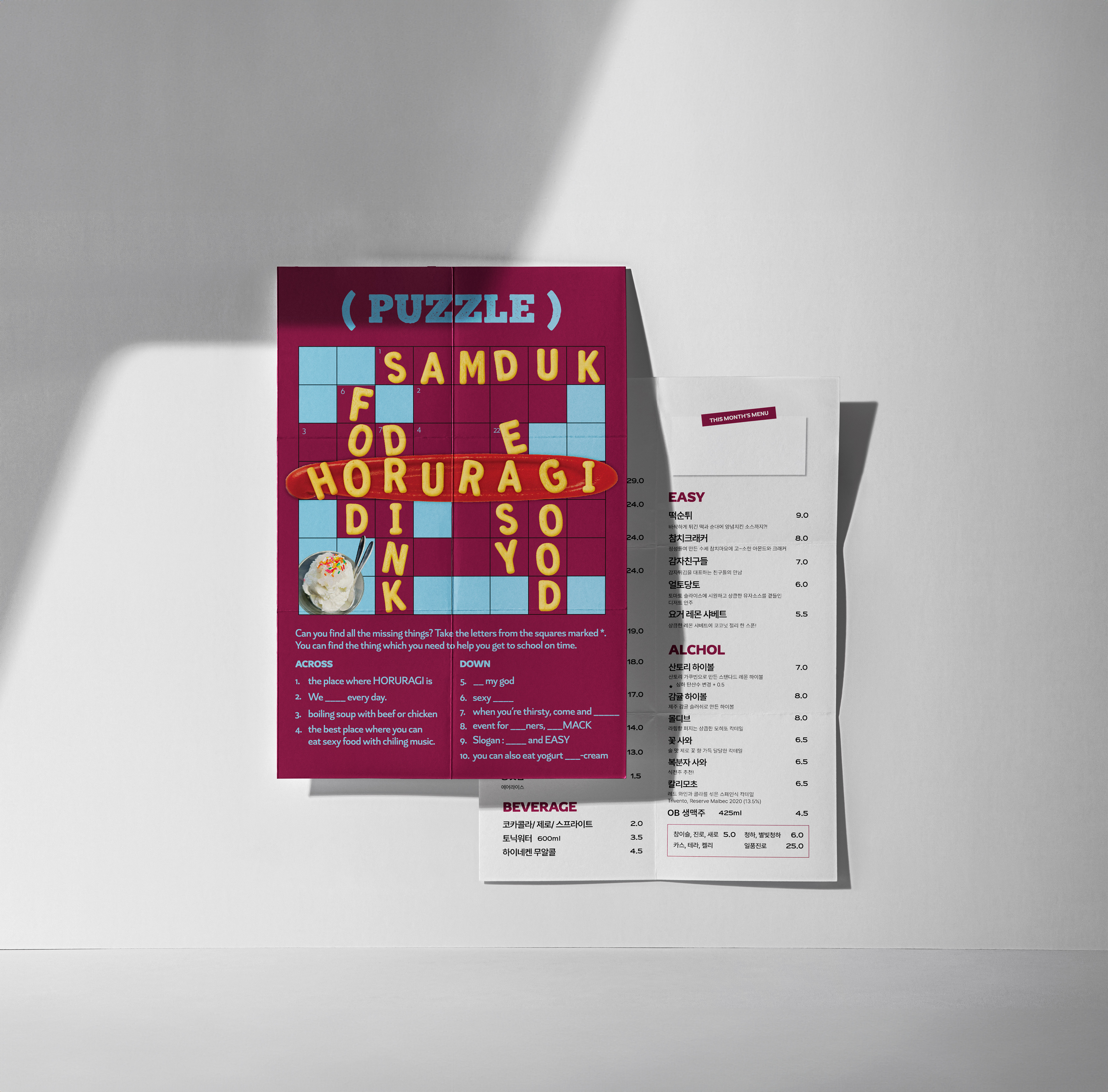
This is a menu design project for Horuragi, created to reflect the brand’s playful and quirky personality.
The front layout takes the form of a word puzzle, blending the brand name and key spatial keywords in a lighthearted way. An AI-generated image of french fries was layered over the text to add visual humor and charm.
The front layout takes the form of a word puzzle, blending the brand name and key spatial keywords in a lighthearted way. An AI-generated image of french fries was layered over the text to add visual humor and charm.
More than just a menu, it was designed to become a fun, branded object that naturally communicates the spirit of the space.
호루라기의 브랜드 개성과 유쾌한 분위기를 담아낸 메뉴판 디자인 작업입니다.
전면에는 퍼즐 형식을 활용해 브랜드 이름과 공간의 키워드를 유쾌하게 구성했으며, 텍스트 위에 감자튀김 이미지를 합성하여 위트 있는 시각 요소를 더했습니다.
단순한 메뉴 안내를 넘어, 브랜드의 성격이 자연스럽게 드러나는 ‘재미있는 오브제’가 되도록 기획한 디자인입니다.
전면에는 퍼즐 형식을 활용해 브랜드 이름과 공간의 키워드를 유쾌하게 구성했으며, 텍스트 위에 감자튀김 이미지를 합성하여 위트 있는 시각 요소를 더했습니다.
단순한 메뉴 안내를 넘어, 브랜드의 성격이 자연스럽게 드러나는 ‘재미있는 오브제’가 되도록 기획한 디자인입니다.