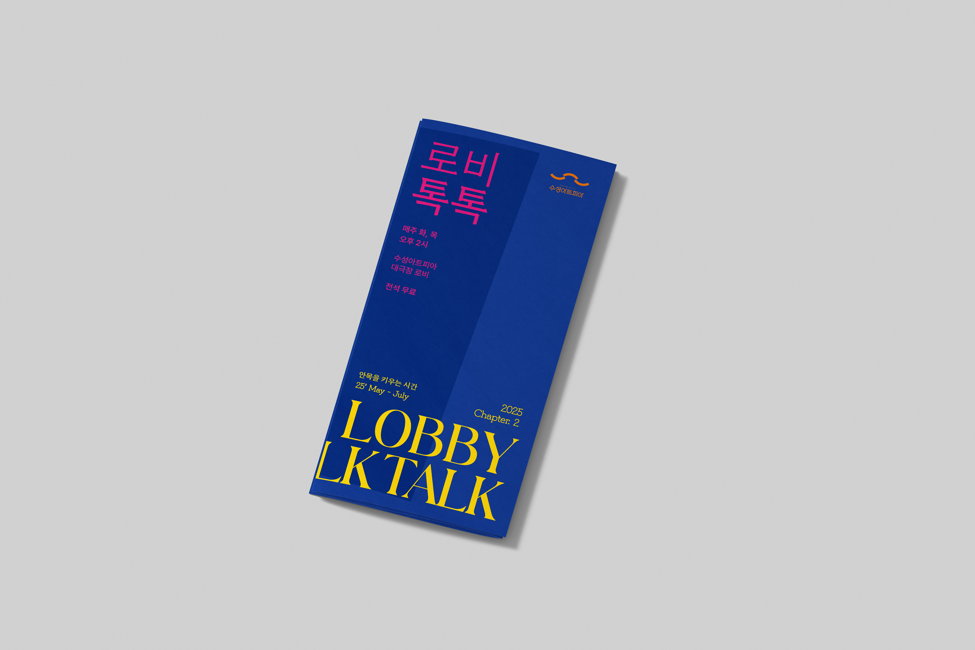
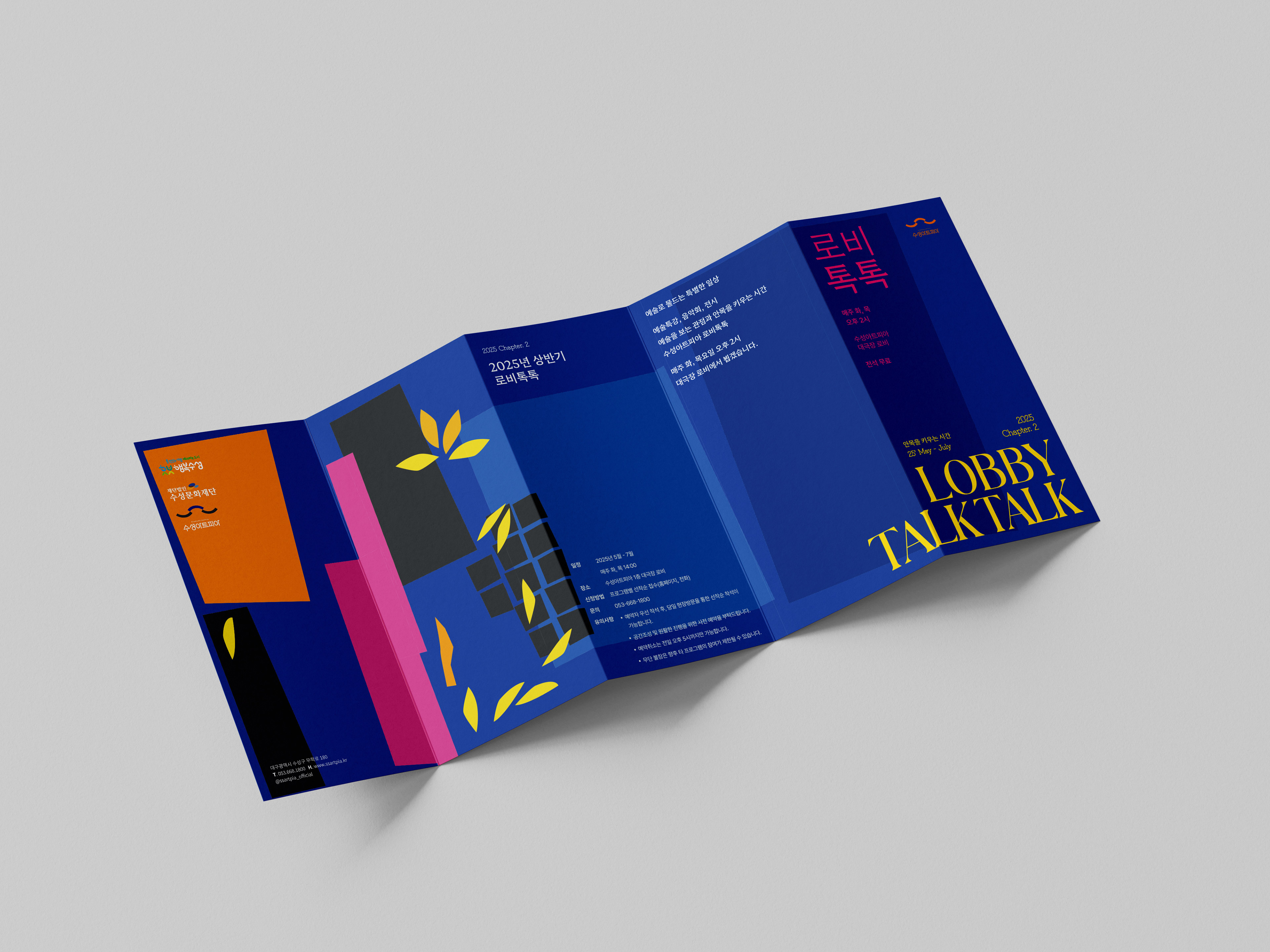
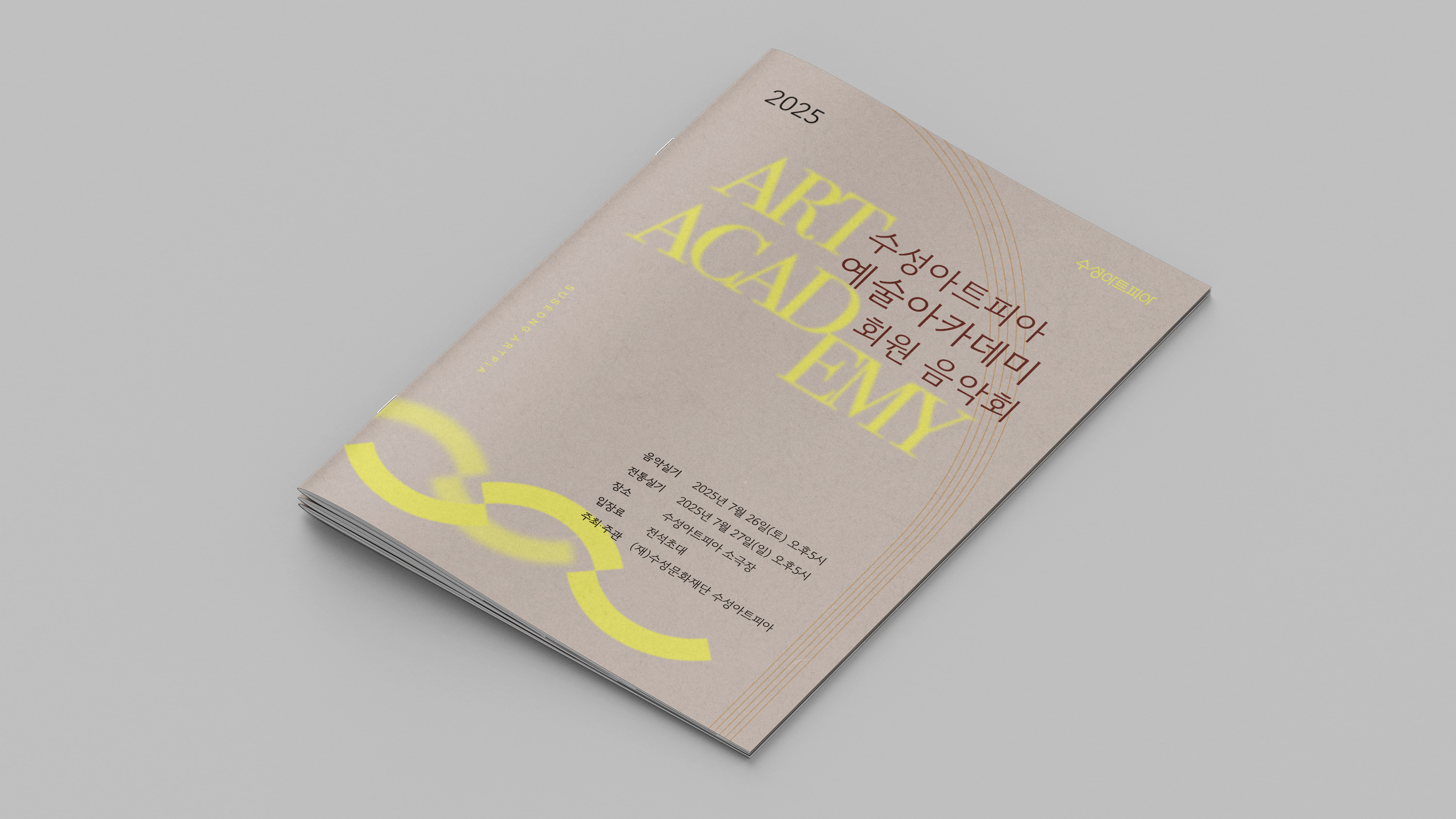
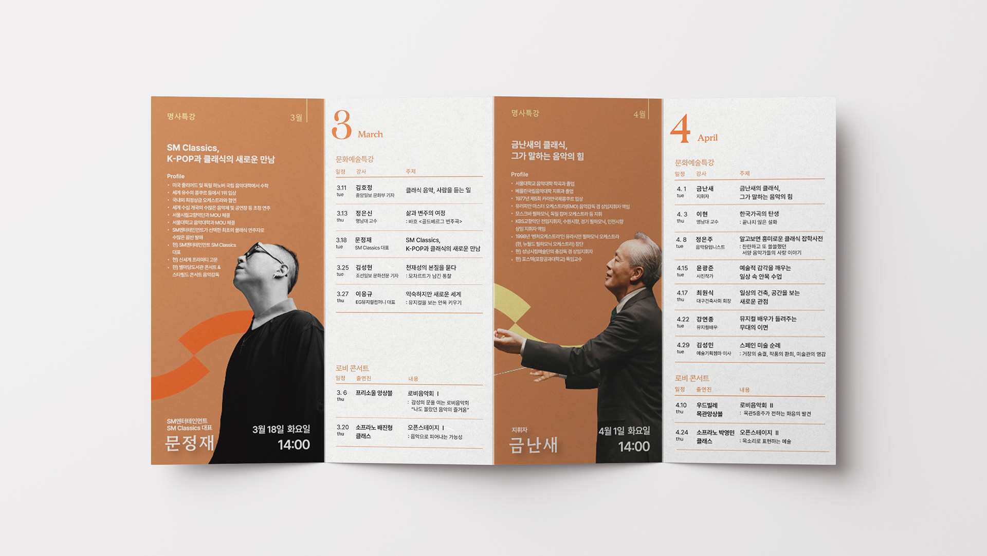
Chapter 2 was designed for the summer season, focusing on fresh and vibrant tones. Inspired by the colors and elements found in Matisse’s paintings, the overall visual mood was developed to reflect a sense of seasonal brightness.
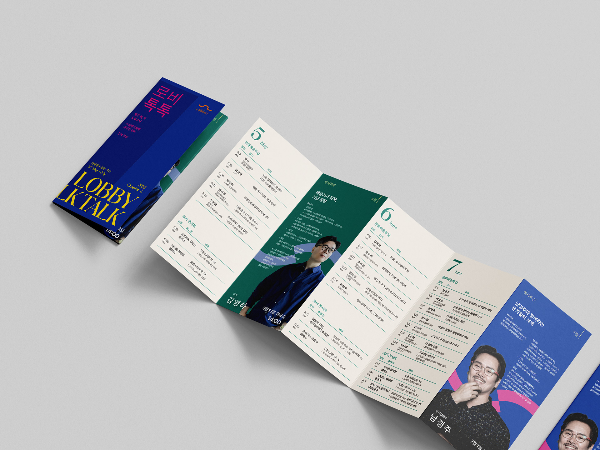
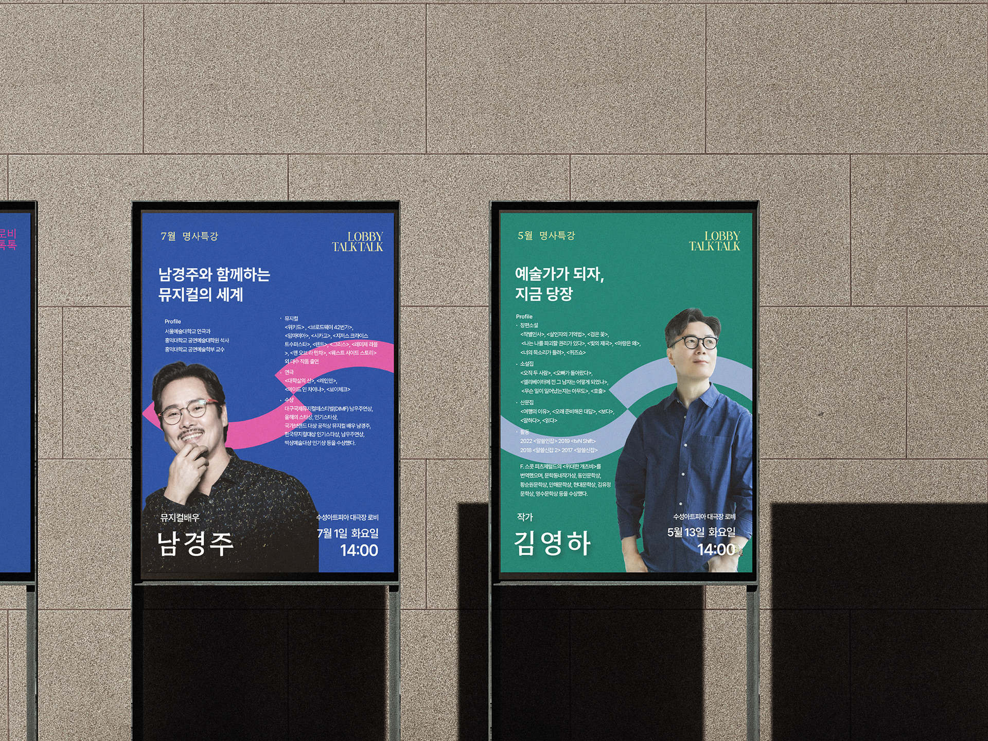
The internal layout follows the same structure as Chapter 1, placing emphasis on the featured lectures by highlighting speaker photos to improve clarity and visual engagement.
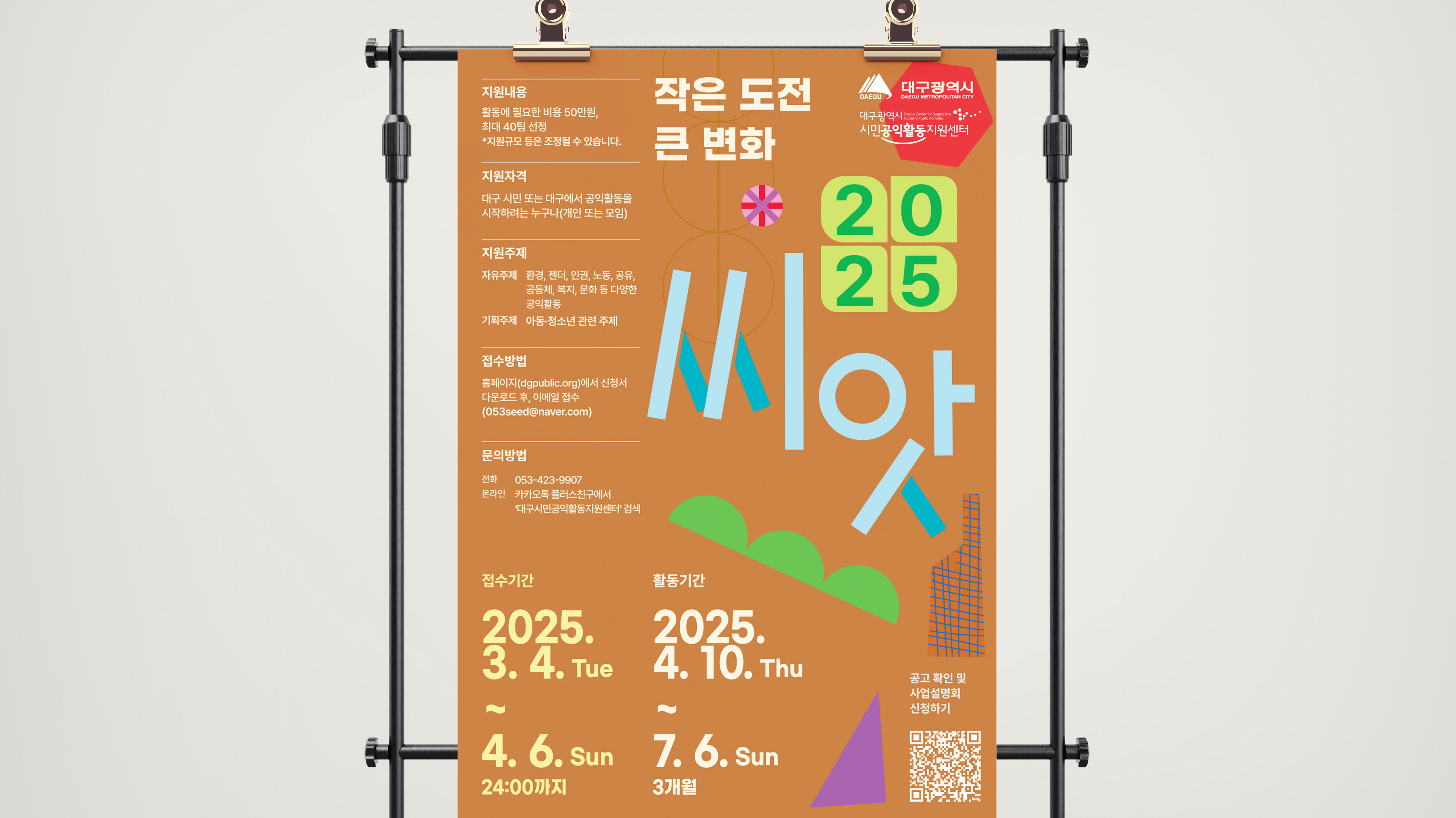
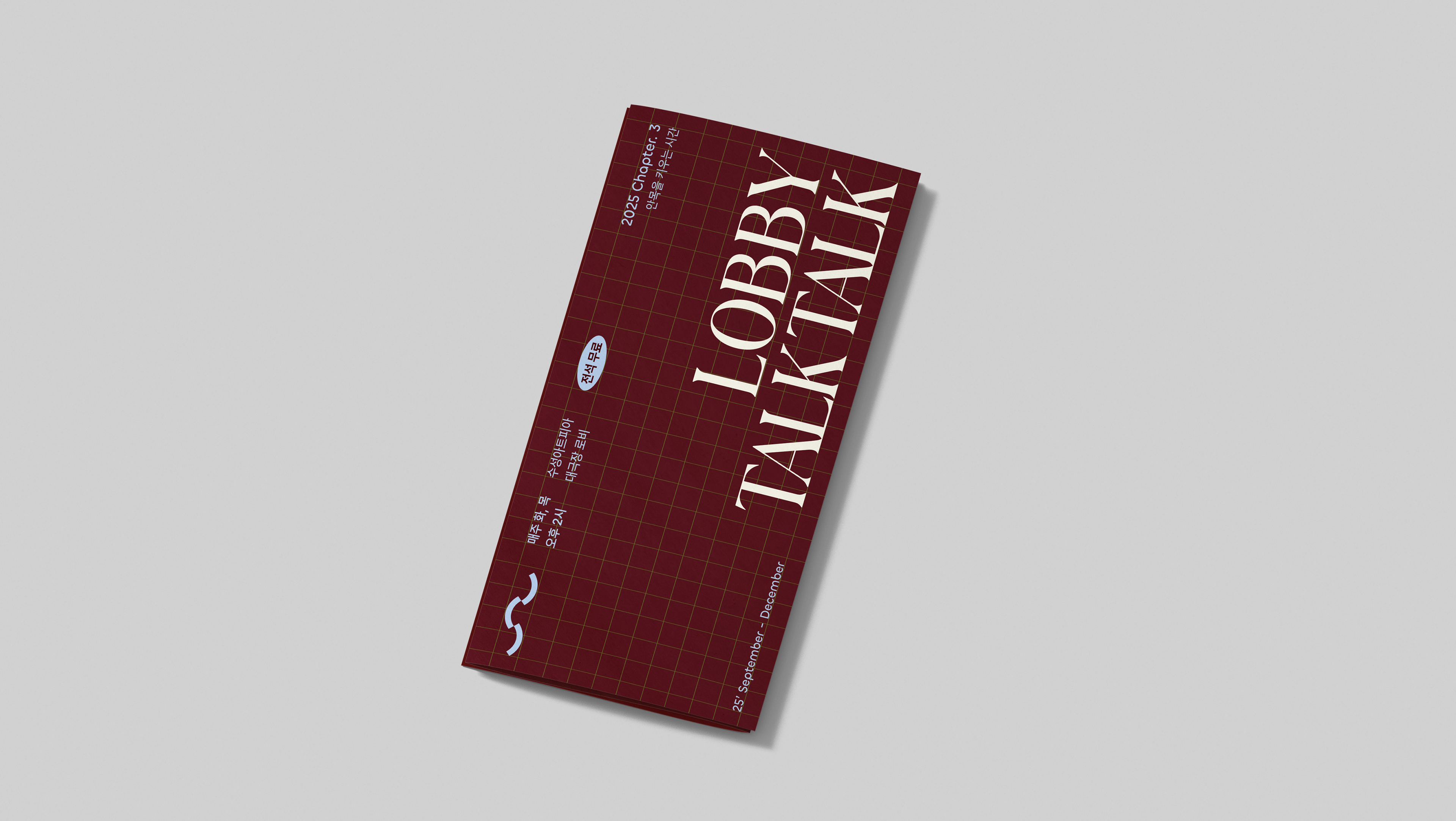
Designed as a 5-fold layout to cover a 3-month schedule, the leaflet prioritizes clear and structured delivery of detailed information.
Designed as a 5-fold layout to cover a 3-month schedule, the leaflet prioritizes clear and structured delivery of detailed information.
Chapter 2는 여름 시즌에 맞춰, 청량한 분위기를 전하기 위해 색상에 고민을 더했습니다. 마티스의 그림에서 영감을 받은 색감과 그래픽 요소들을 적용해 전체적인 톤과 레이아웃을 설정했습니다.
내부 구성은 Chapter 1과 동일하게 유지하여 명사 특강의 핵심을 강조하고자 사진을 크게 배치해 시각적 집중도와 가독성을 높였습니다. 총 3개월 분량의 정보를 담은 5단 접지 형식으로, 많은 내용을 효과적으로 전달하는 데 중점을 두었습니다.