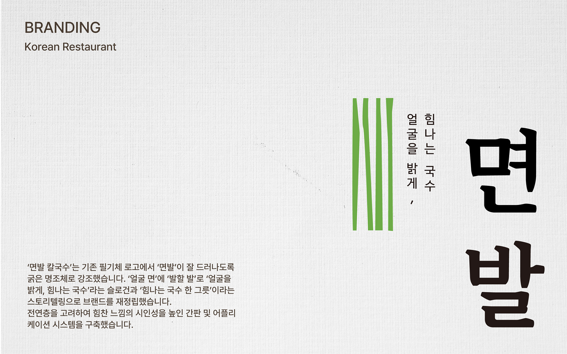
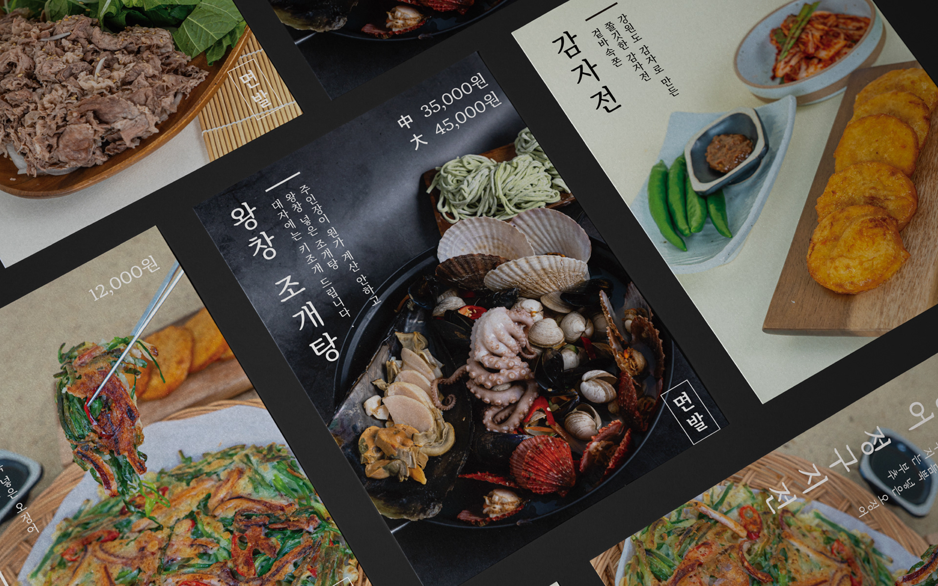
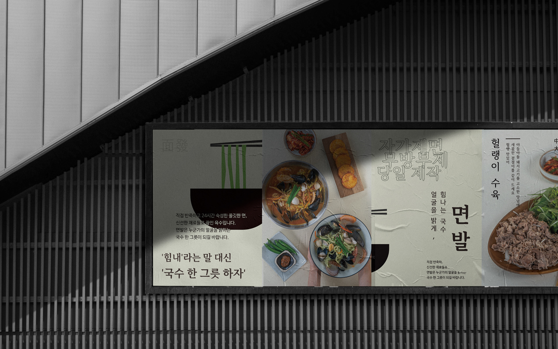
Myenbal Kalguksu underwent a rebranding to highlight the core of its name—“myenbal”, which refers to the energy of noodles.
Moving away from the previous script-style logo, the new identity uses a bold serif font to clearly emphasize the brand name. Drawing from the Chinese characters for “face (面)” and “bright (發),” we proposed the slogan: “Noodles that brighten your face.” This was paired with a brand story centered on “A bowl of energizing noodles.”
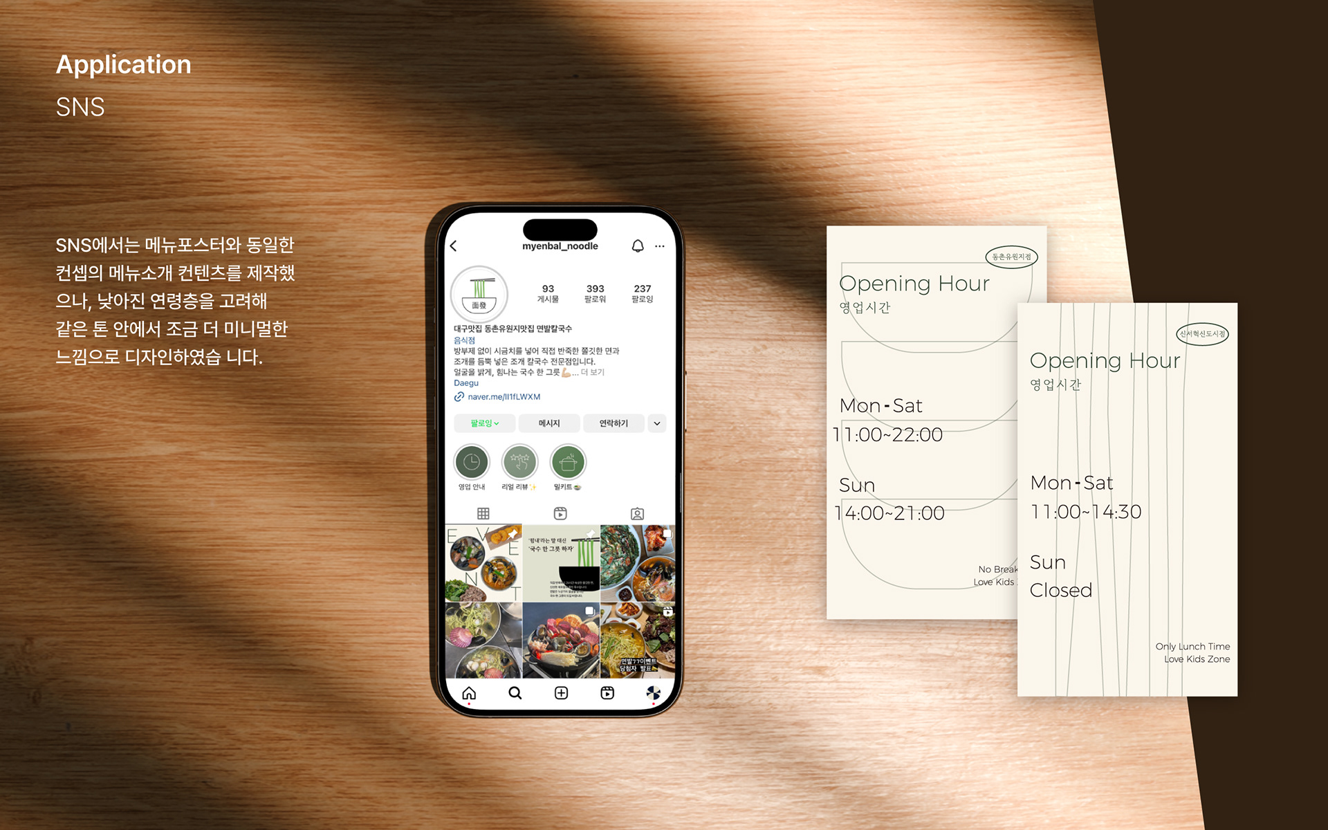
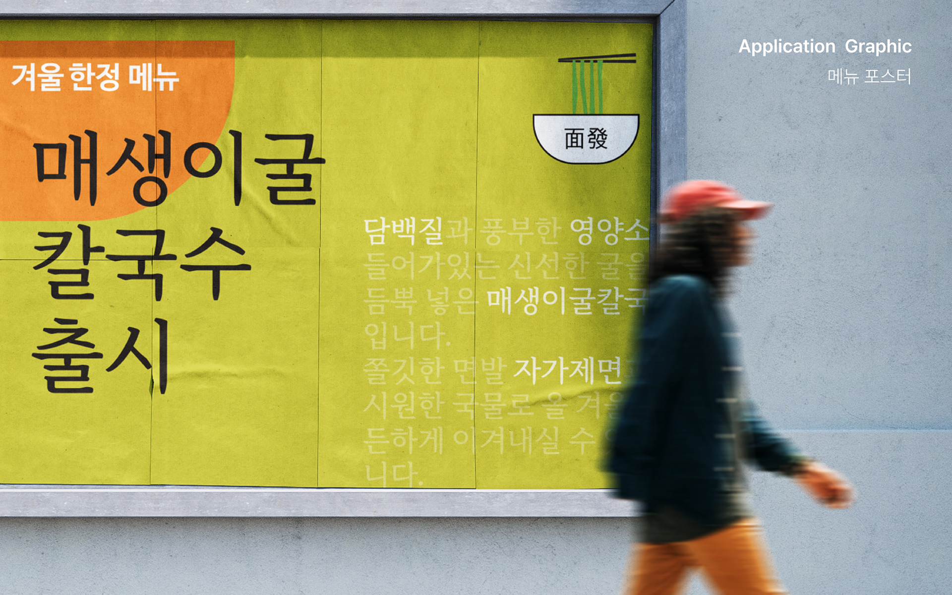
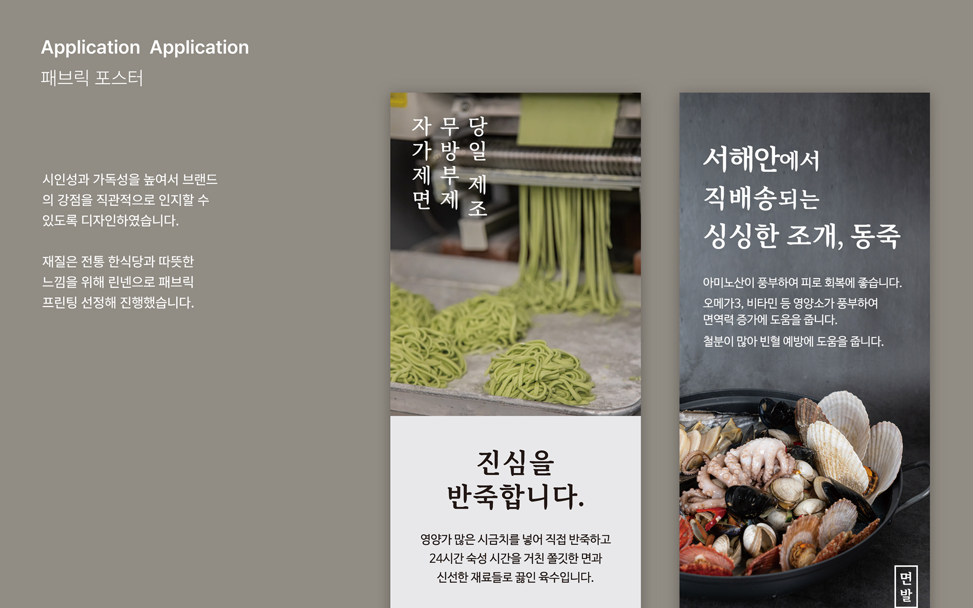
To appeal to a broad age range, we developed a signage and application system focused on legibility and vitality, allowing the brand’s uplifting message to be consistently communicated across physical and digital touchpoints.
‘면발 칼국수’는 기존의 필기체 로고에서 벗어나, 브랜드 이름 속 핵심인 ‘면발’이 명확히 드러나도록 굵은 명조체를 사용해 시각적으로 강조했습니다.
‘얼굴 면(面)’과 ‘밝을 발(發)’이라는 한자의 의미를 살려 “얼굴을 밝게, 힘나는 국수”라는 슬로건과 함께, “힘나는 국수 한 그릇”*이라는 브랜드 스토리를 새롭게 정립했습니다.
‘얼굴 면(面)’과 ‘밝을 발(發)’이라는 한자의 의미를 살려 “얼굴을 밝게, 힘나는 국수”라는 슬로건과 함께, “힘나는 국수 한 그릇”*이라는 브랜드 스토리를 새롭게 정립했습니다.
전 연령층을 아우를 수 있도록 시인성을 높인 간판 디자인과 응용 시스템을 구축해, 브랜드의 에너지가 실제 공간과 매체를 통해 전달될 수 있도록 구성했습니다.