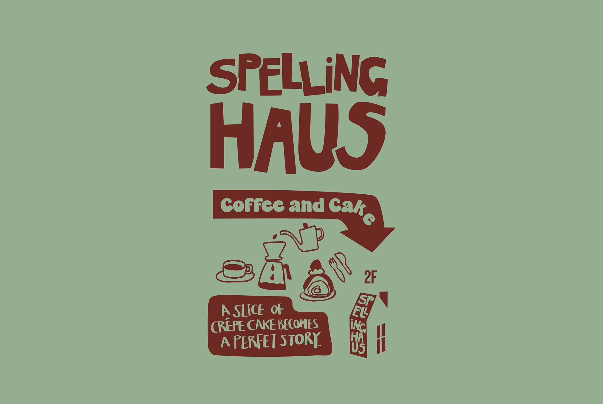
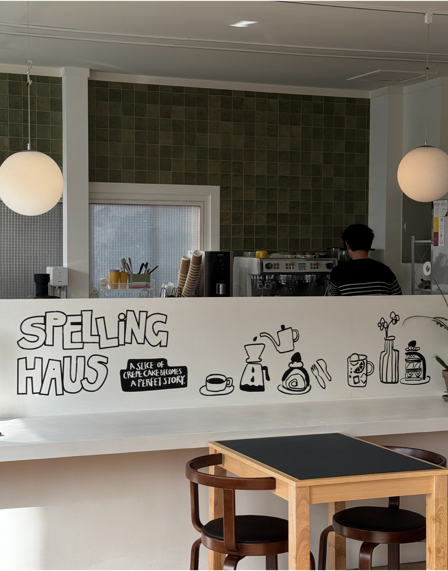
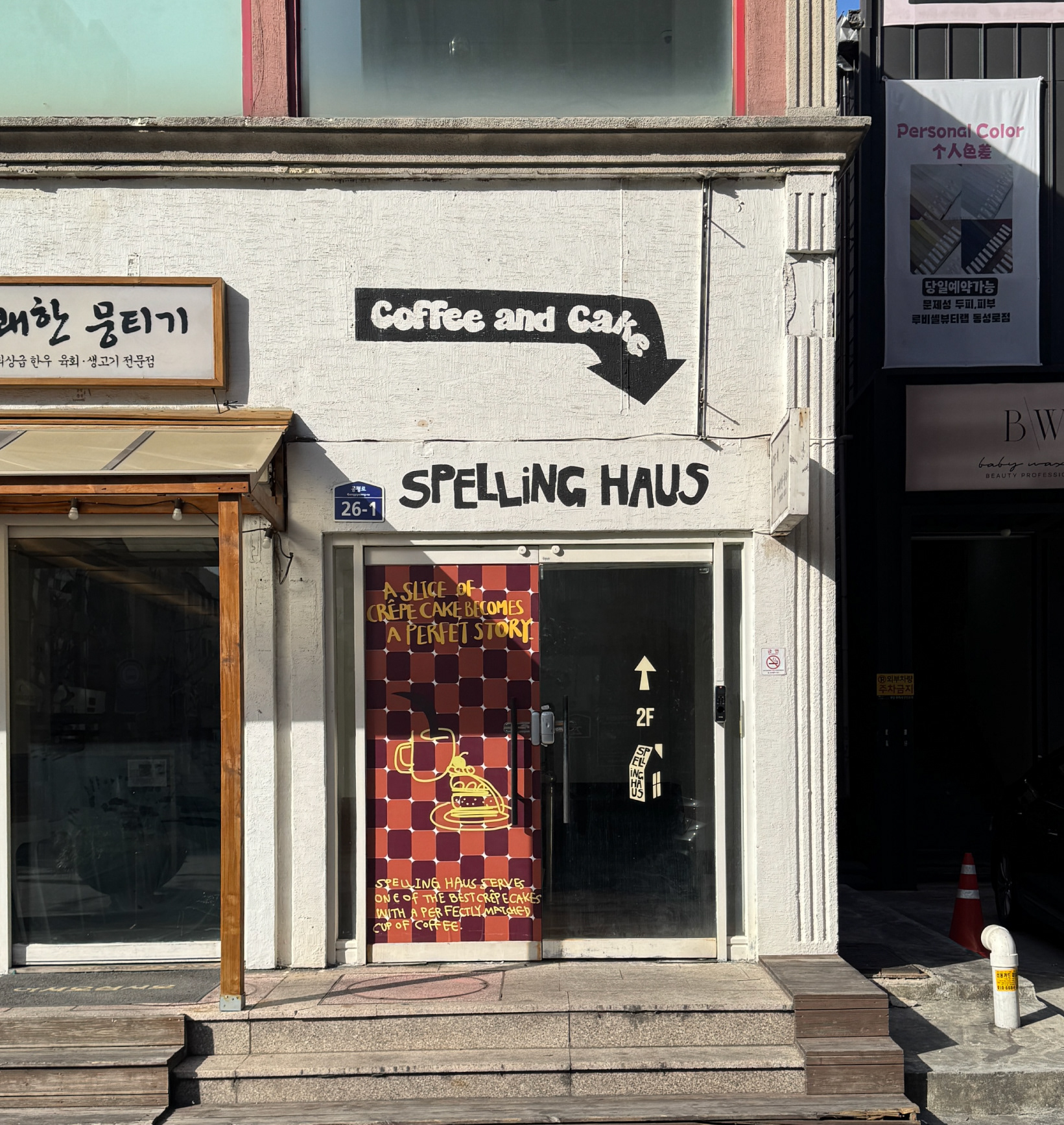
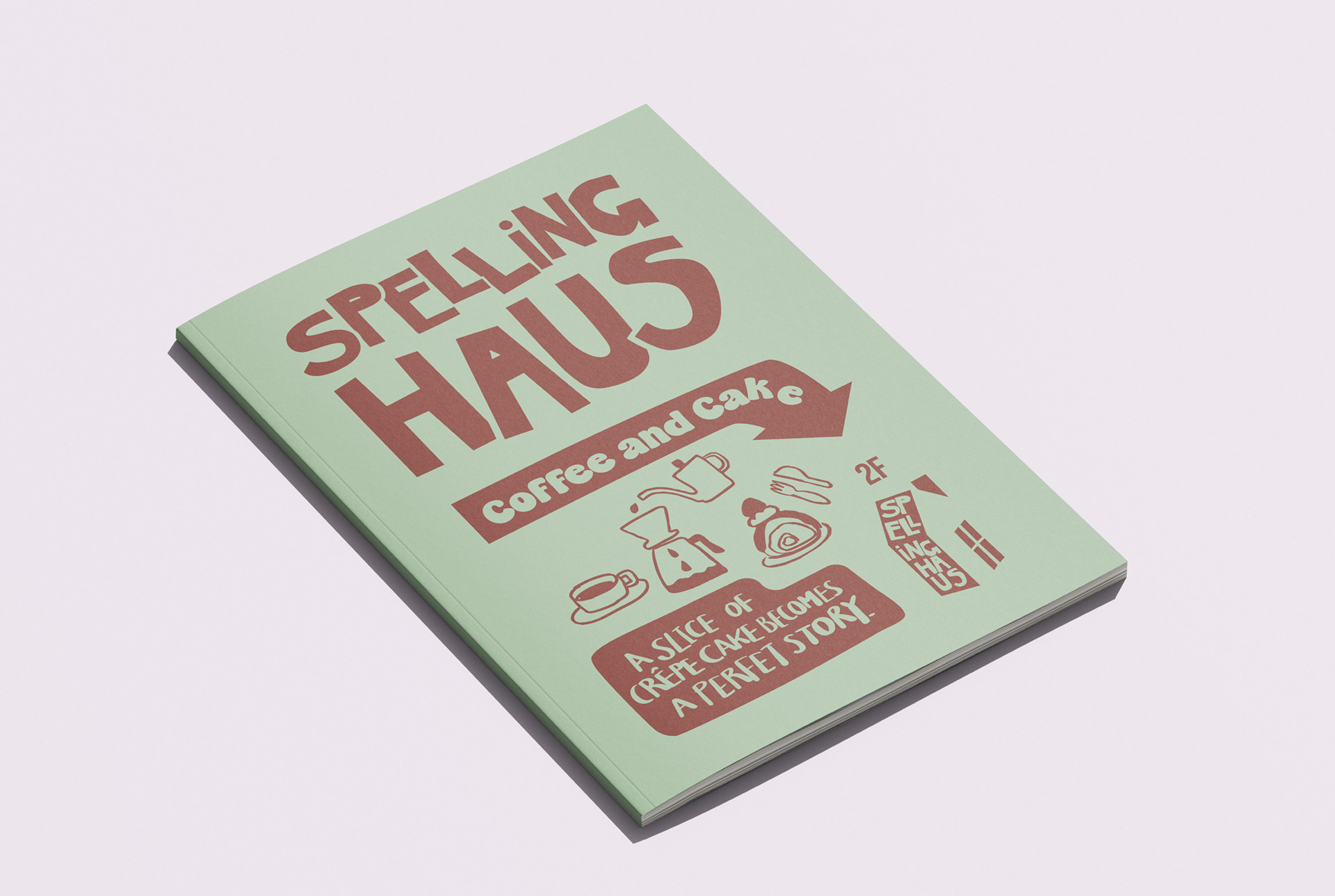
Spelling Haus is a concept café specializing in crepe cakes, with a name that means “a house that collects words and letters.”
Much like a crepe cake, the brand story is built on the idea that “words layer like crepes, and stories gather piece by piece.” The space was designed to offer a small but meaningful variation in everyday life.
Much like a crepe cake, the brand story is built on the idea that “words layer like crepes, and stories gather piece by piece.” The space was designed to offer a small but meaningful variation in everyday life.
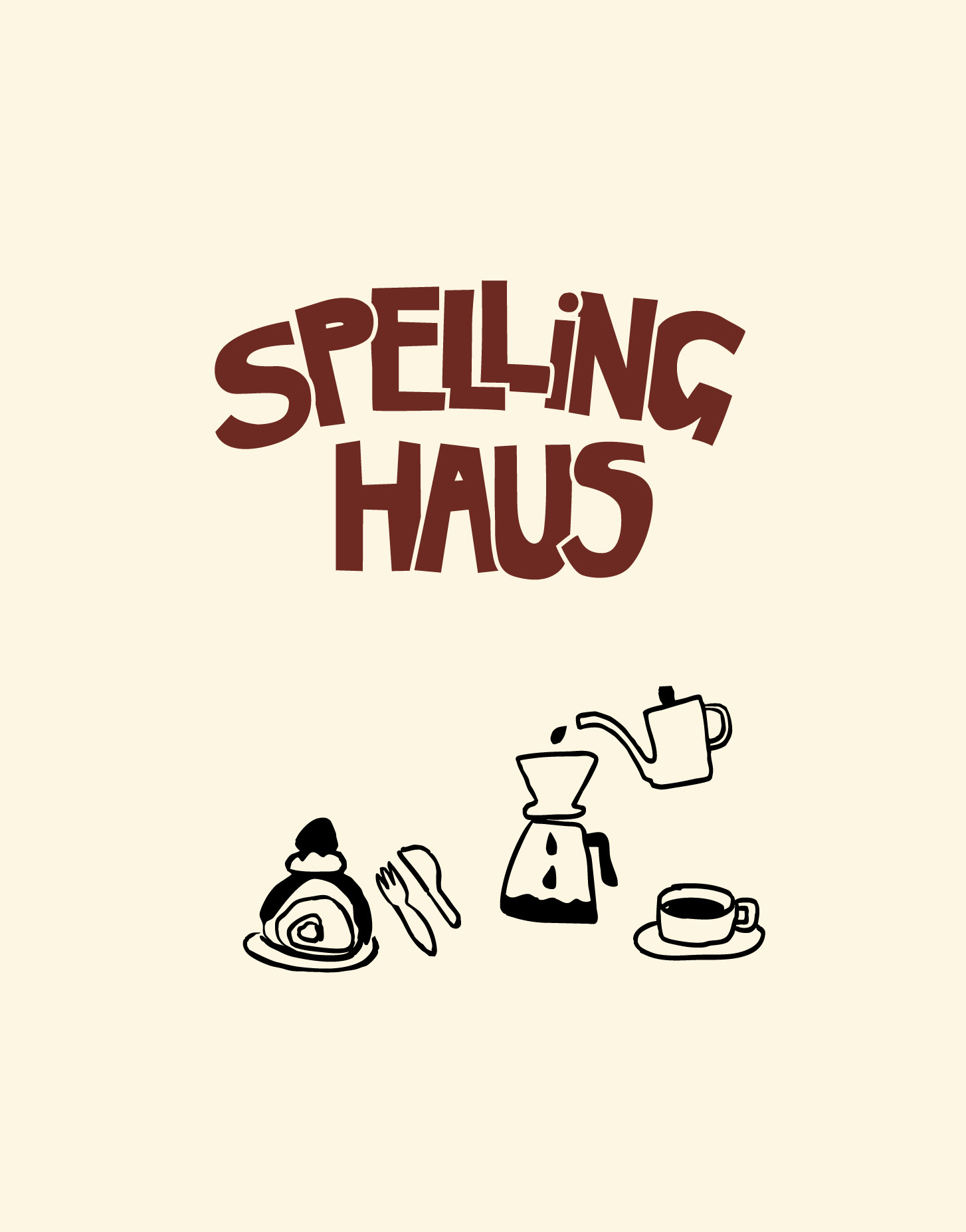
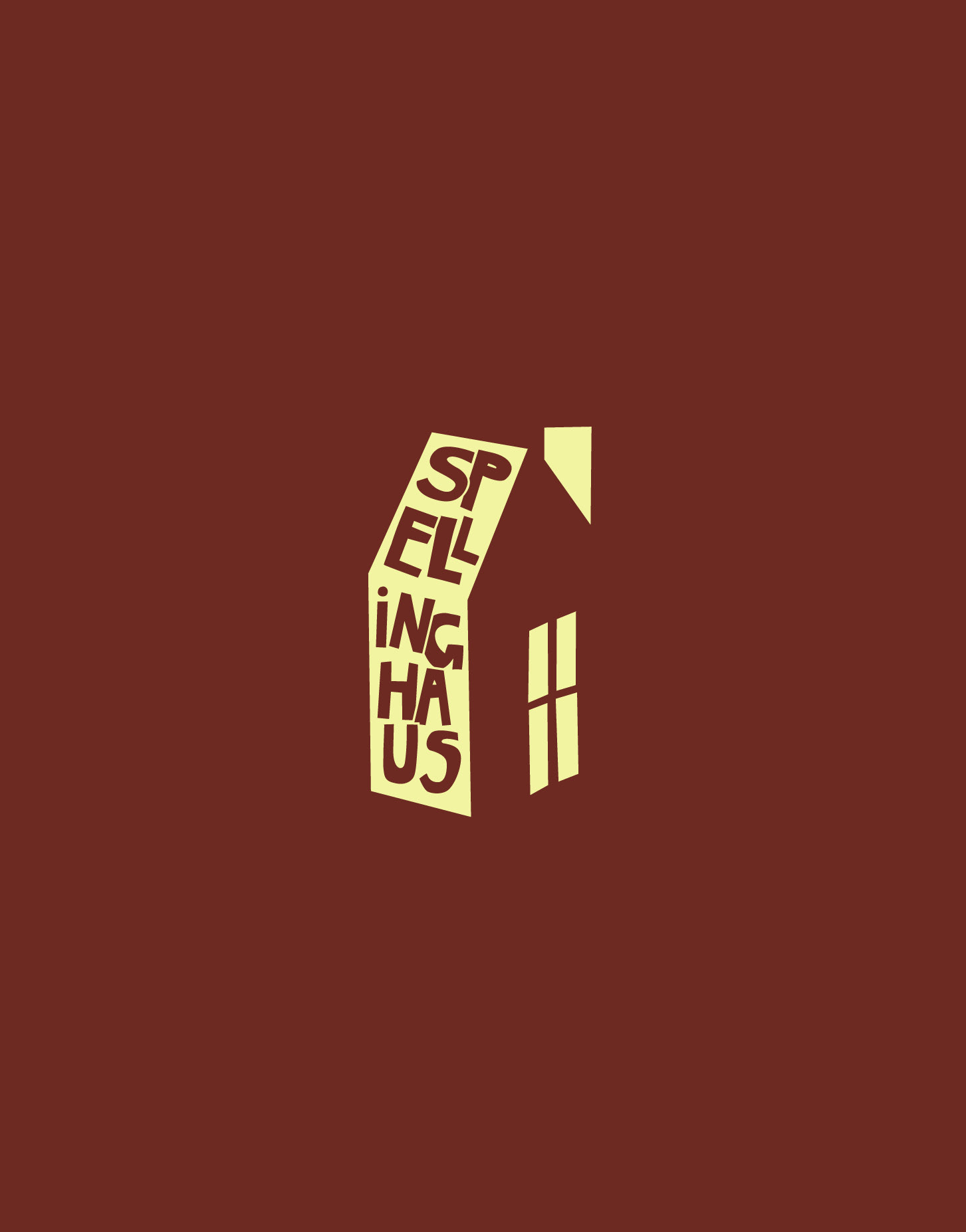
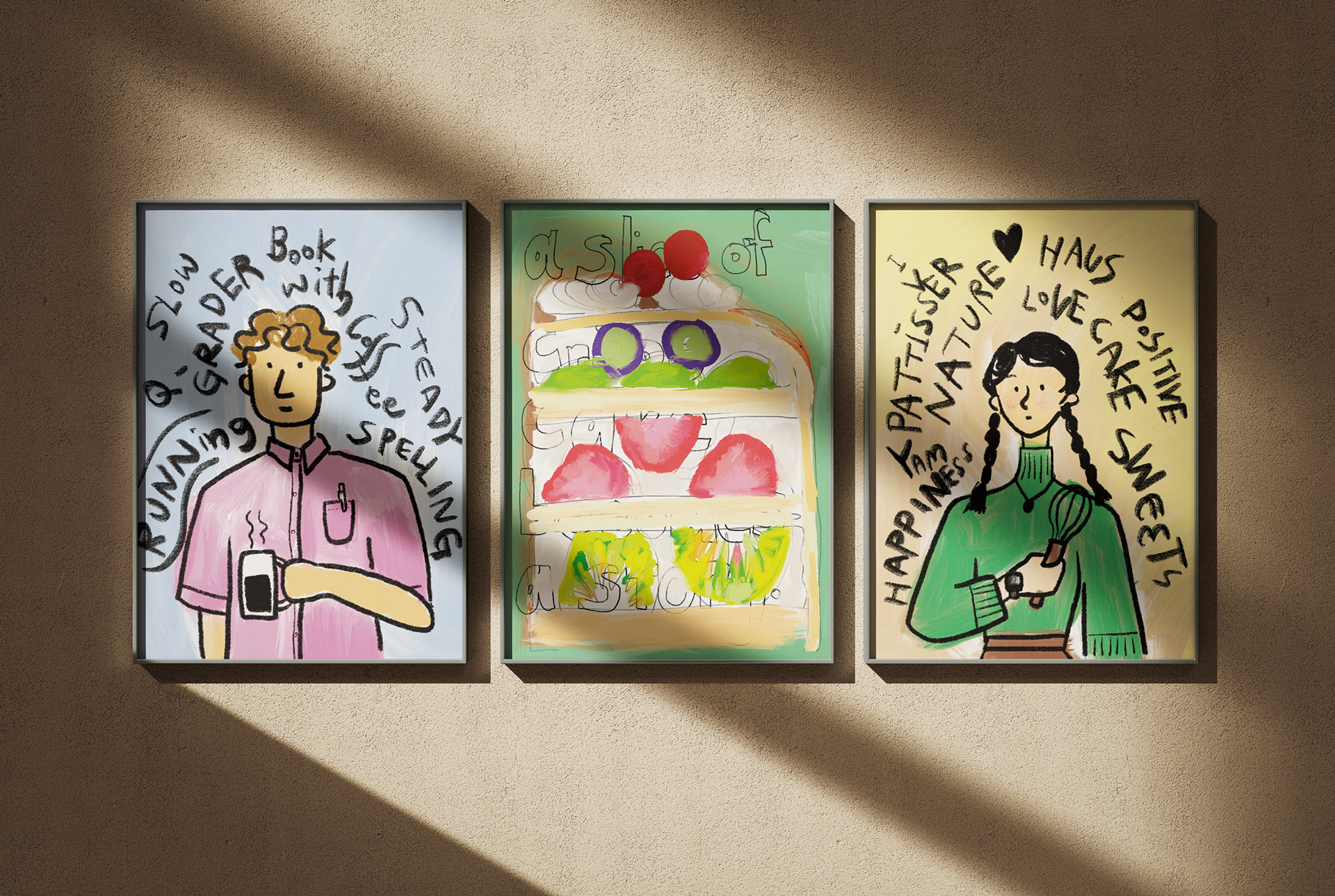
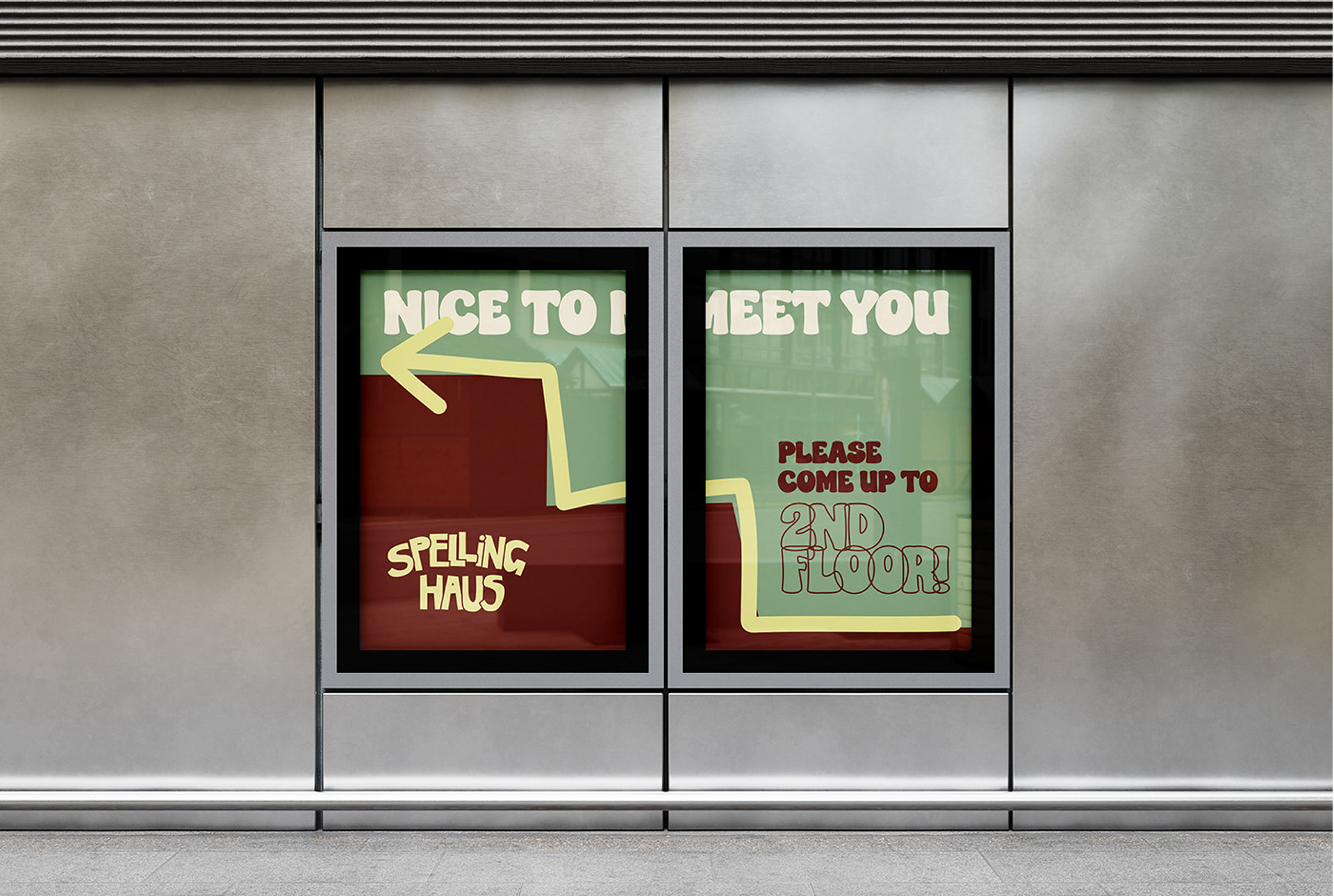
The brand identity centers on typography and handwritten elements, paired with a playful and warm tone that reflects the personality of the founders.
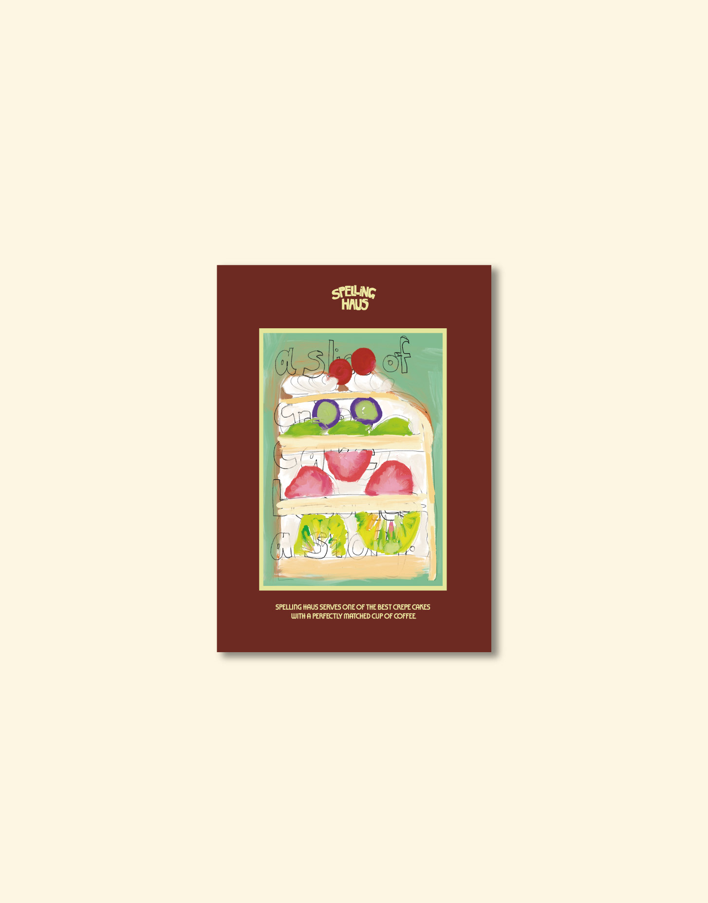
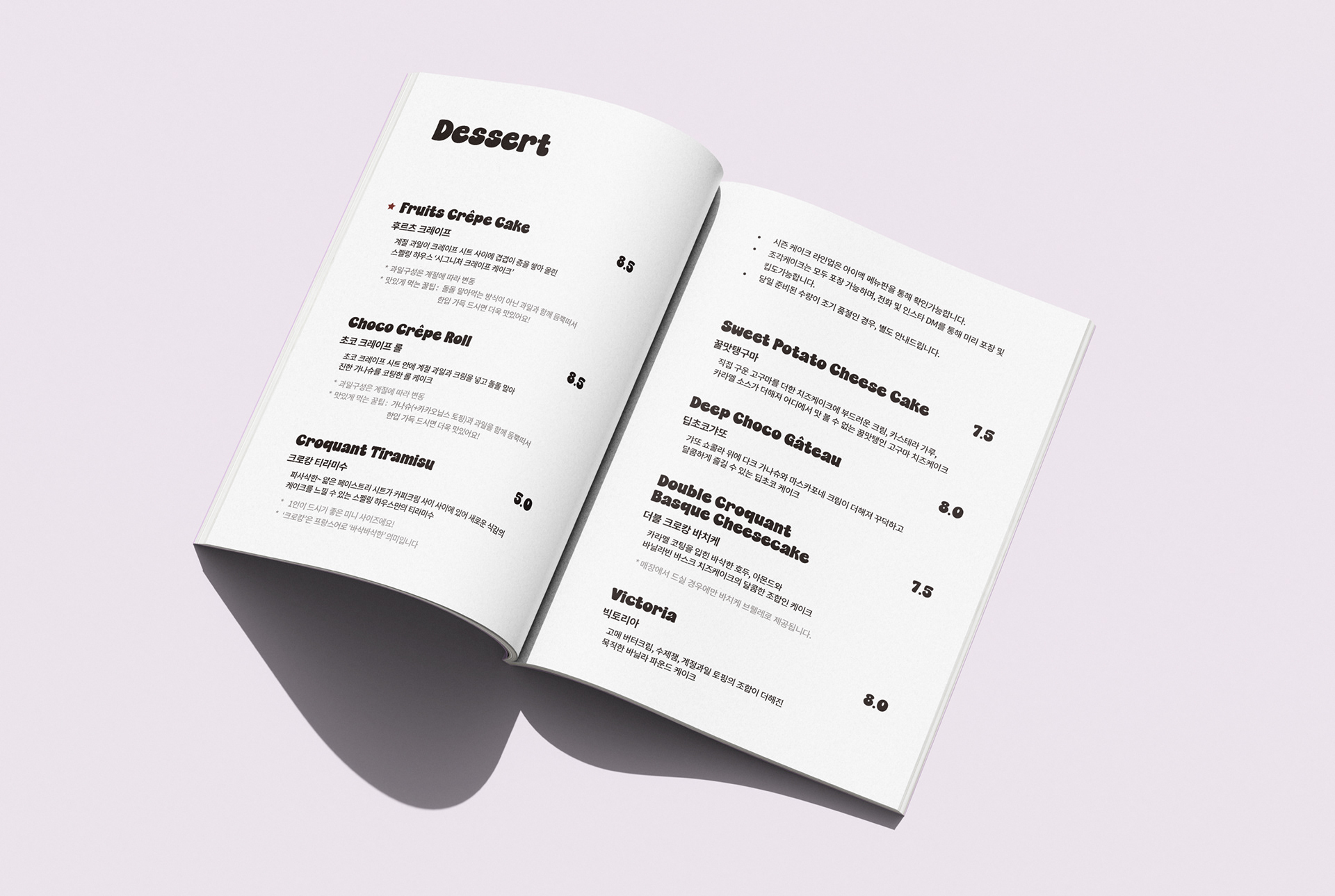
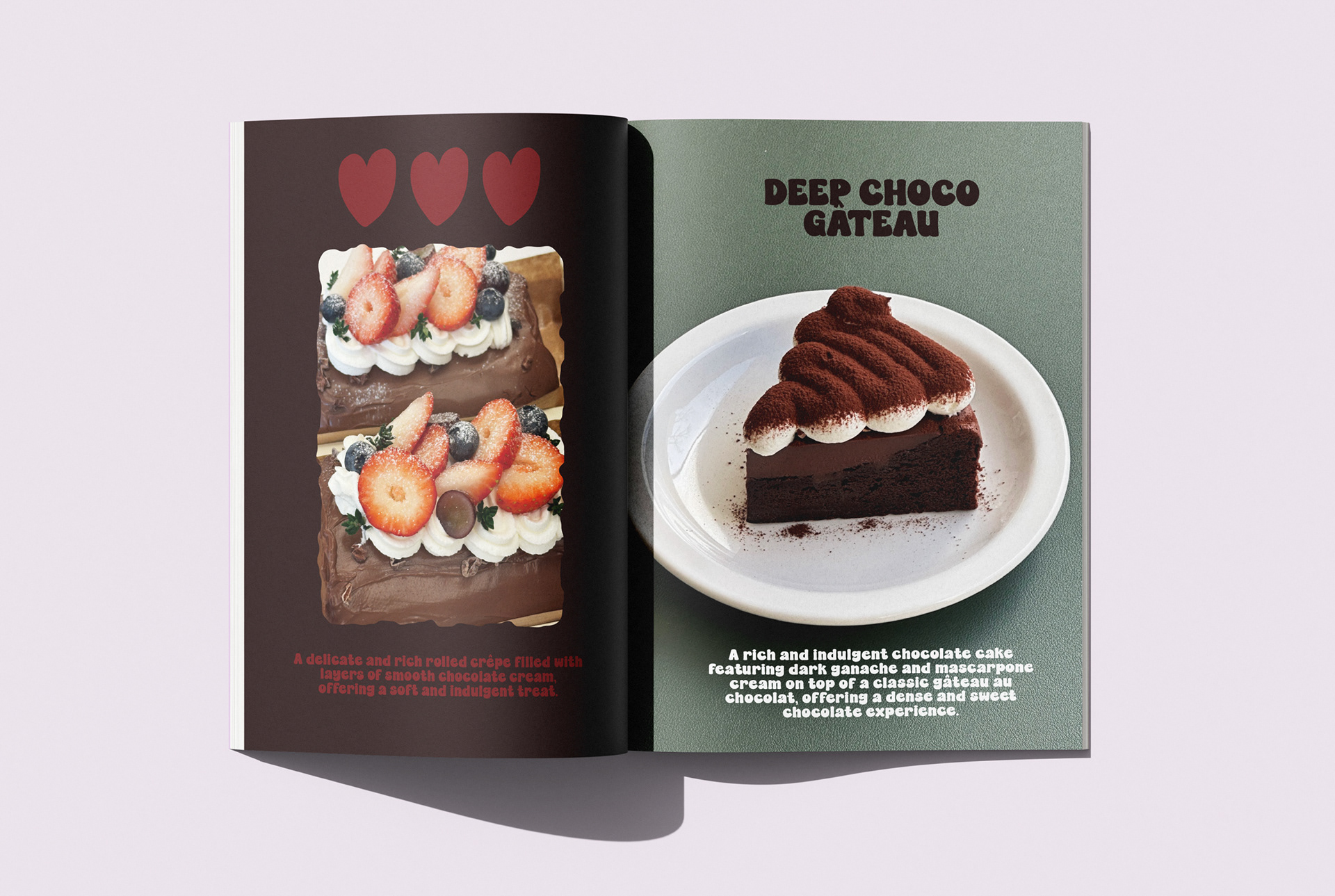
A key element of the visual system is the hand-drawn crepe cake illustration, which adds a kitschy charm while reinforcing the café’s signature menu item in a memorable way.
A key element of the visual system is the hand-drawn crepe cake illustration, which adds a kitschy charm while reinforcing the café’s signature menu item in a memorable way.
‘스펠링하우스’는 글과 단어를 수집하는 ‘집’이라는 의미를 가진 이름으로, 크레이프 케이크를 주력으로 판매하는 감성 카페입니다.
크레이프 케이크처럼 “한 겹씩 쌓이는 단어, 한 조각씩 모이는 이야기”라는 브랜드 스토리를 중심에 두고, 일상에 작은 변주를 더하는 공간이 되기를 바라는 마음으로 브랜딩을 진행했습니다.
크레이프 케이크처럼 “한 겹씩 쌓이는 단어, 한 조각씩 모이는 이야기”라는 브랜드 스토리를 중심에 두고, 일상에 작은 변주를 더하는 공간이 되기를 바라는 마음으로 브랜딩을 진행했습니다.
브랜드의 정체성은 타이포그래피와 손글씨를 중심으로 구축했으며, 대표님들이 지향하는 유쾌하고 따뜻한 무드를 전하기 위해 키치한 일러스트와 색감, 그래픽 요소들을 조합했습니다.
특히 크레이프 케이크 드로잉을 활용해 주력 메뉴를 키치하게 표현함으로써, 시각적 이미지와 브랜드 인상을 효과적으로 각인시켰습니다.
특히 크레이프 케이크 드로잉을 활용해 주력 메뉴를 키치하게 표현함으로써, 시각적 이미지와 브랜드 인상을 효과적으로 각인시켰습니다.